This is where it learns to do more.
A 45-minute Studio in live color direction using AI tools. Grounded in the research on color psychology and online buyer behavior. Translated into direction you can use with your Canva and AI tools immediately. Get on-brand marketing graphics every time.
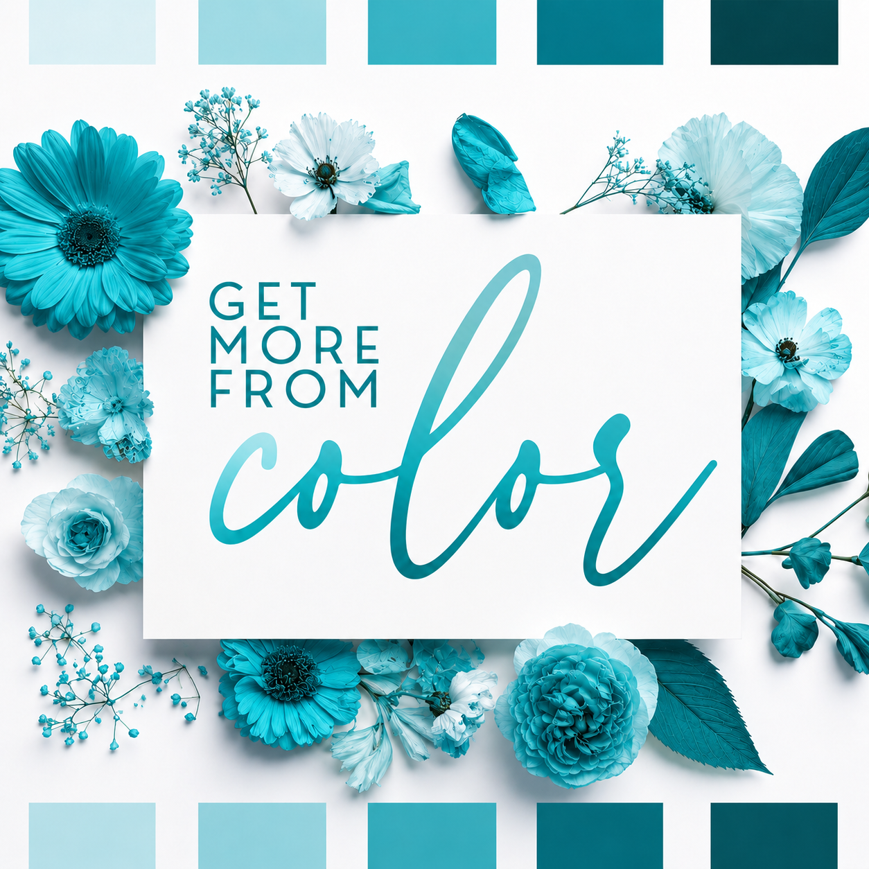
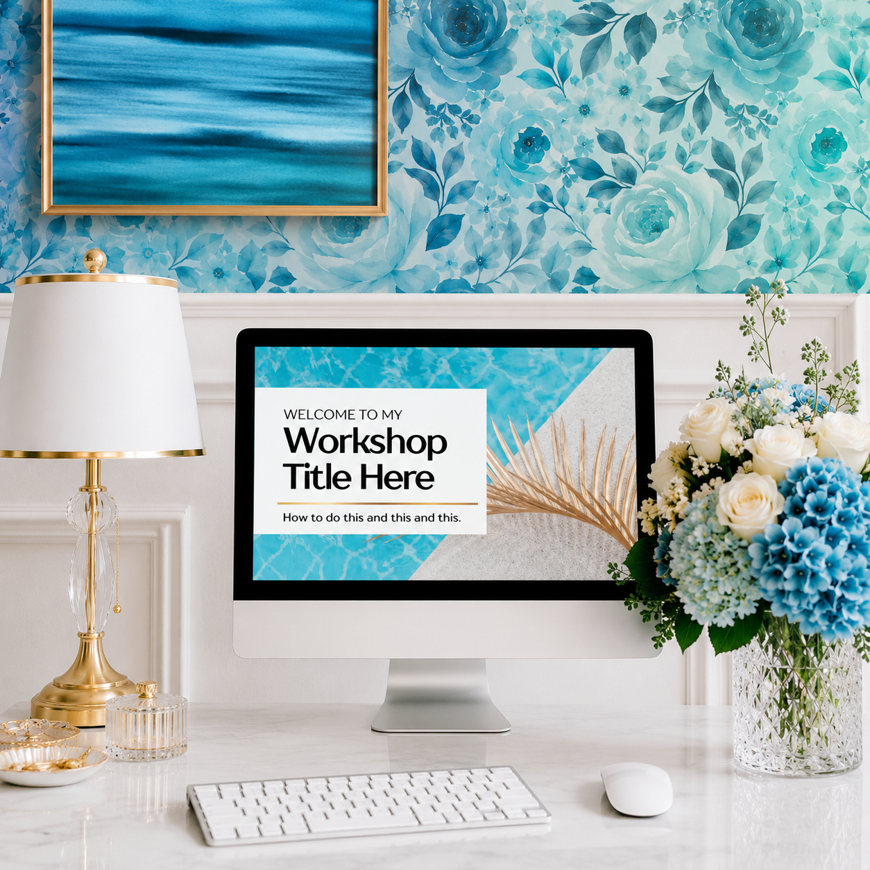
Get More From Turquoise STUDIO
Aquamarine Depth That Catches the Light
🩵 A system you can implement in 45 minutes, to give your AI tools better creative direction, so they can create bespoke marketing visuals that are always on-brand.
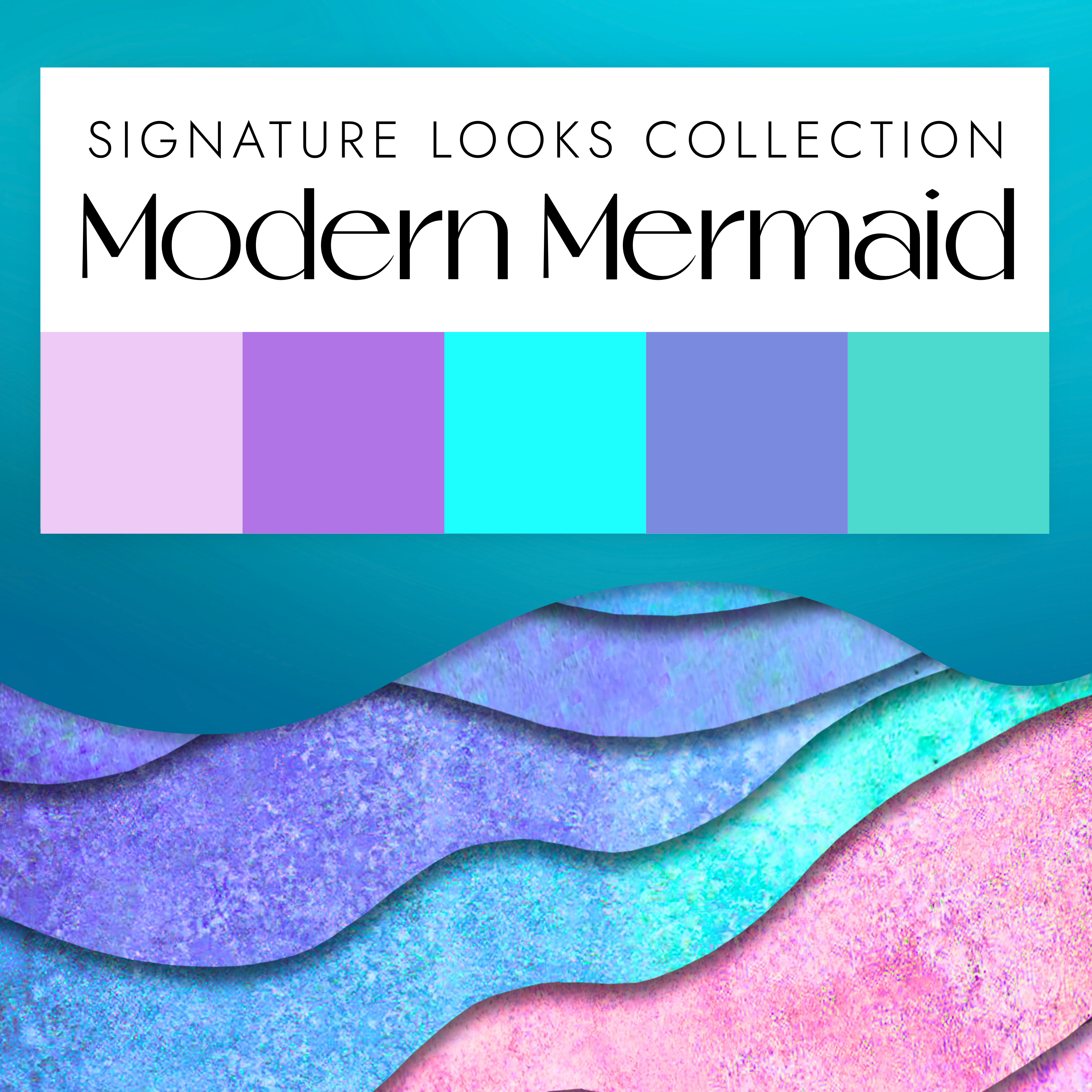
For brands built around turquoise, this training explores the fresh, luminous, and energizing range inside your palette. We'll look at pale aqua, clear turquoise, blue-green depth, watery gradients, light-filled accents, and the supporting shades that help turquoise feel calm, bright, elevated, or dynamic.
Turquoise sits at the meeting point of blue's trust and green's vitality, which is part of why it reads as both grounded and alive. It is the color of clear water and open sky, the palette that makes a brand feel like a breath rather than a push. When you build in turquoise, you are working with a range that photographs beautifully, pairs easily, and still holds enough saturation to stand out in a feed full of muted neutrals.
Includes a custom AI prompt system and a Claude skill. Use these tools to discover fresh ways to use turquoise across your graphics, emails, promotions, with more visual range and stronger brand consistency.
Get instant access to the pre-recorded Get-More-With-Turquoise training so you can start right away, plus an invitation to the next scheduled live Zoom Studio session where you can watch the process in real time, ask questions, and get feedback.

Live Studio Sessions: Mondays 7-8pm ET and Fridays 11am-12pm ET on Zoom. Link delivered immediately post-purchase.

About The Get More From Color Studio Series:
Better AI Images Start With Better Color Language
AI can create marketing assets beautifully once it has clear direction. In the Studio, we create that direction together. You’ll leave knowing how to use your AI tool of choice to make marketing visuals that feel unmistakably yours.

When it comes to designing marketing graphics with AI tools, the goal is simple: better direction going in, better branded visuals coming out.
In each Studio, we develop precise, color-specific prompt language for your brand. We look at the textures, supporting tones, contrast levels, and visual moods that help AI generate images closer to your aesthetic.

A sophisticated signature color story
Your brand colors have more creative range than you're using right now.
The Current Cycle
After a few years in business, you reach for the same shade in the same places. You open Canva and build around the same identical combinations again and again. Soon, your launches, freebies, and social graphics all start to feel a bit too similar.
The Expanded Range
Let's identify deeper tints, rich accents, adjacent tones, and seasonal accents that uplevel your graphics while keeping your brand immediately recognizable. A strong brand can have variety and still look consistent.


YOU MIGHT ALSO LIKE...
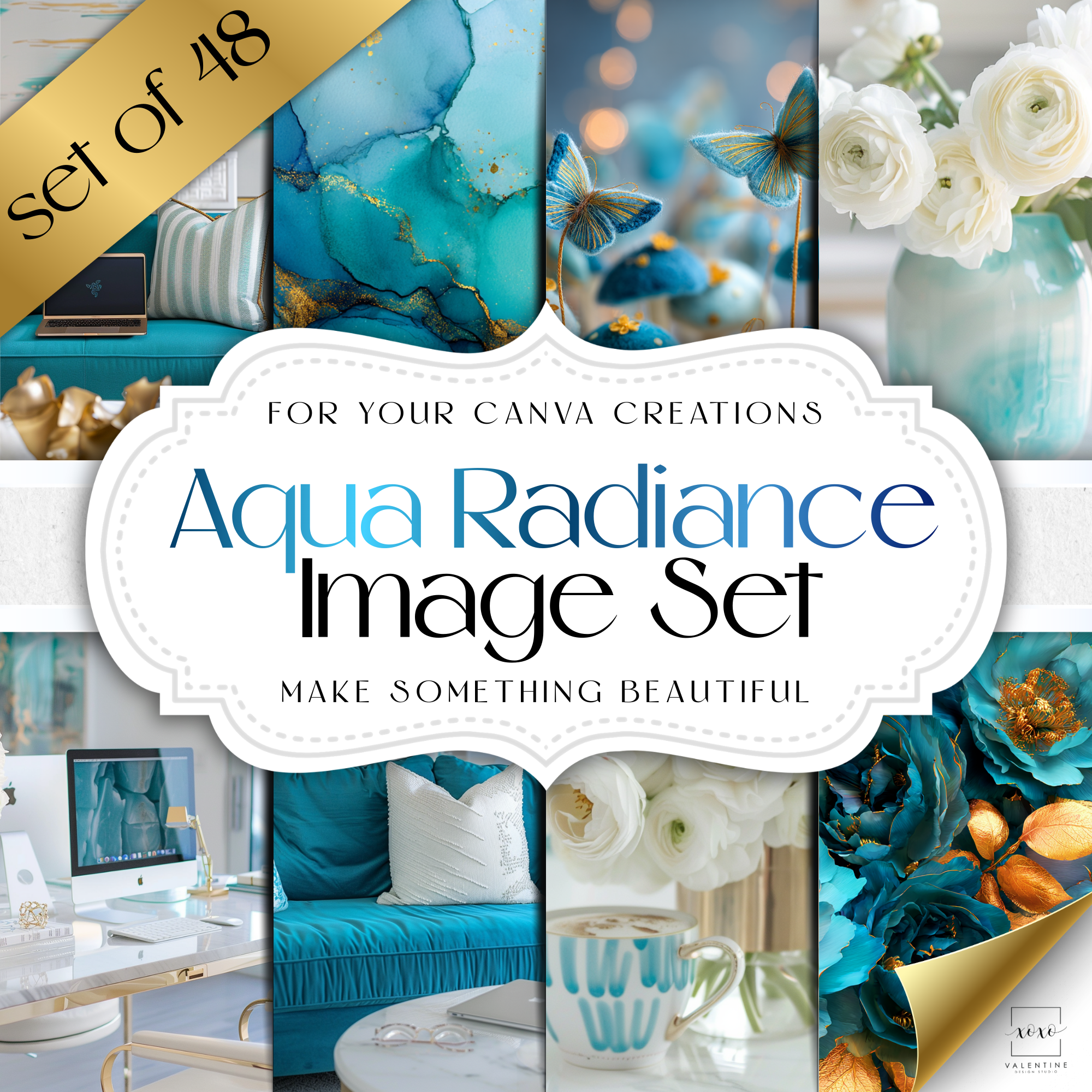
These products designed with turquoise


Get More From Turquoise STUDIO