


In This Issue
The Symmetry Impulse
The Beauty of Balance — Your Audience Craves It
Balance does more than look good. It FEELS good. Symmetry creates that feeling in seconds, and in that moment, buyers are already leaning toward “yes.”
From Behind University Library Paywalls...
The Research
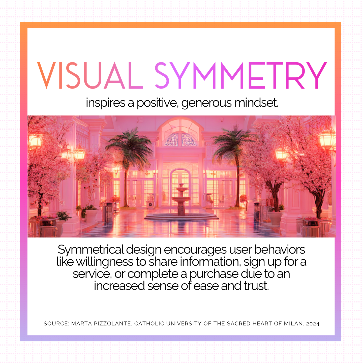
In 2025, a study published in PLoS ONE [Public Library of Science] found that symmetrical logos significantly increased how buyers perceived product quality, stability, and trustworthiness, even when nothing about the actual product changed. The balance alone created the emotional shortcut.
Meanwhile, research in visual psychology from the University of Liverpool shows that our brains process symmetrical designs more easily, which creates a sense of comfort and harmony in seconds. That instant ease makes buyers more open to the message, more confident in the brand, and more willing to take the next step.
Why It Works
calm increases clarity
Balanced visuals lower cognitive load, allowing the viewer to focus on the message instead of the mechanics of the layout. That extra calm clarity makes it easier for buyers to absorb what matters most.
Why It Matters
design primes decisions
Symmetry has been shown to not only improve perceptions but also change buyer behavior, influencing purchase decisions in the moment. When your design is balanced, the decision to act can feel effortless.
The Visual Order That Builds Buyer Confidence
Here's the secret ...
Think: Perceived Professionalism
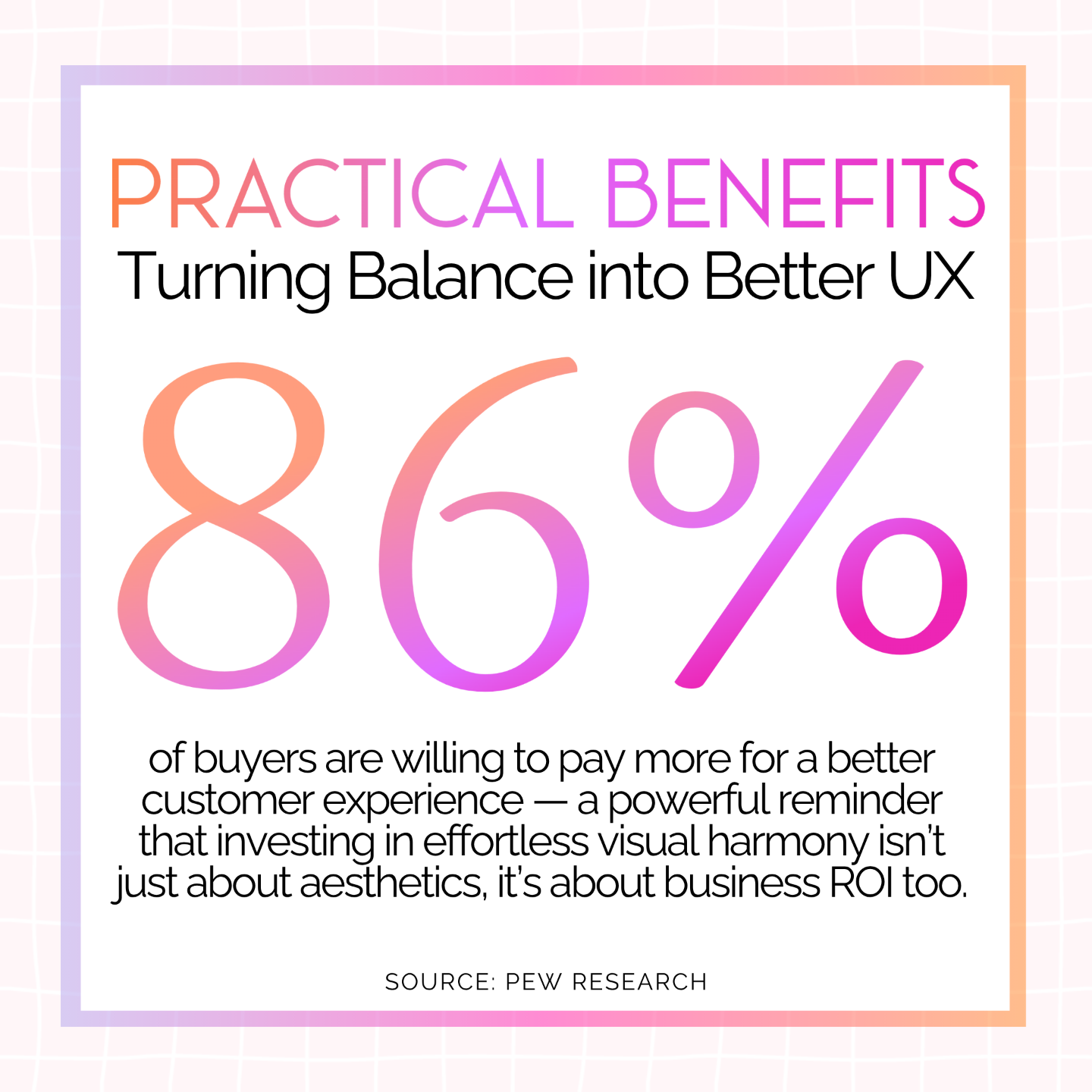
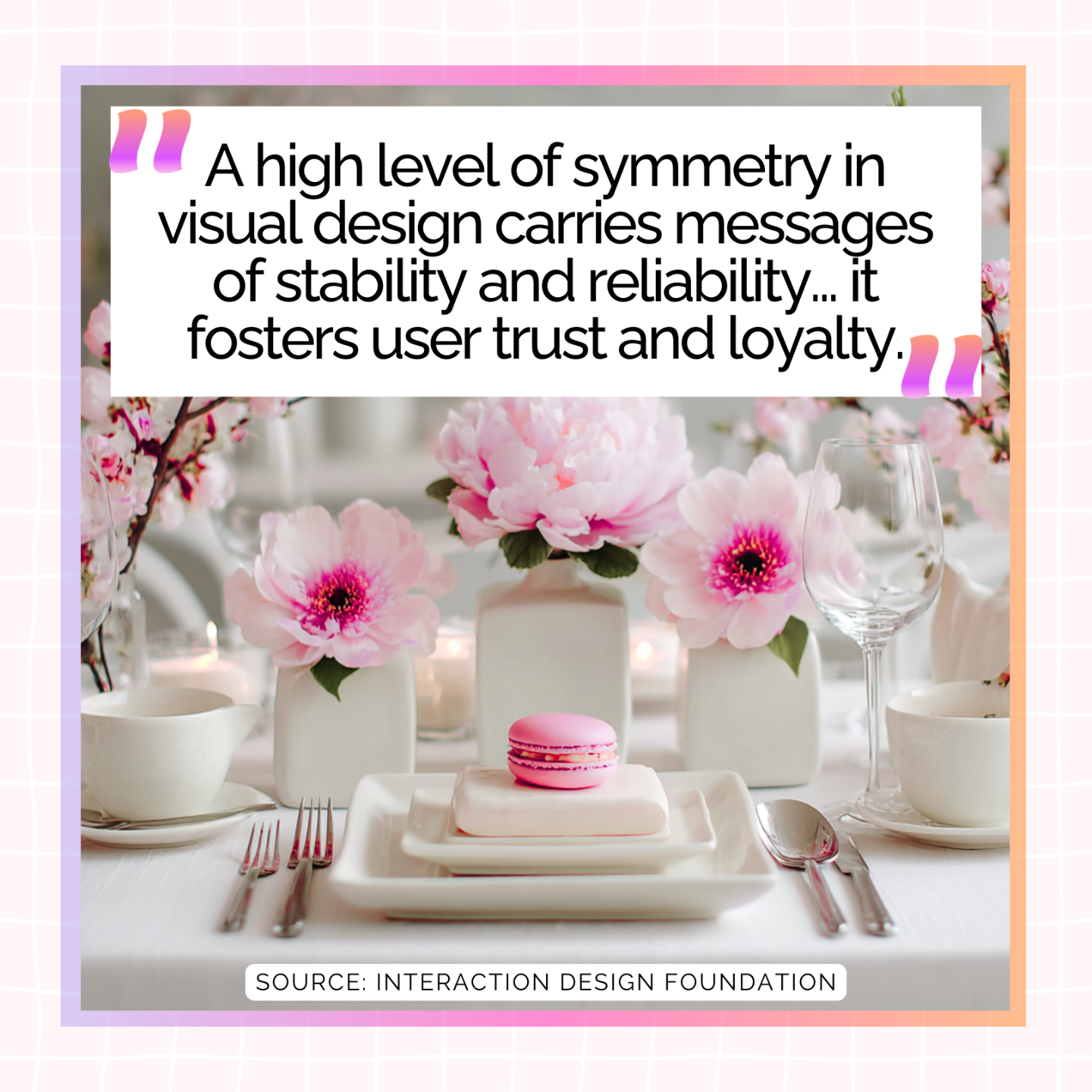
Symmetry in design communicates stability and reliability, two qualities that instantly raise the credibility of what you are offering. When your layout feels orderly, buyers read that order as a sign that your offer is dependable and worth their time.
Even small adjustments toward balance, such as aligning text blocks, centering key visuals, and matching visual weight on both sides, can make your marketing feel more solid and more trustworthy at a glance.
When Visual Harmony Becomes Your...
Unfair Advantage...
The Science of “Easy on the Eyes”
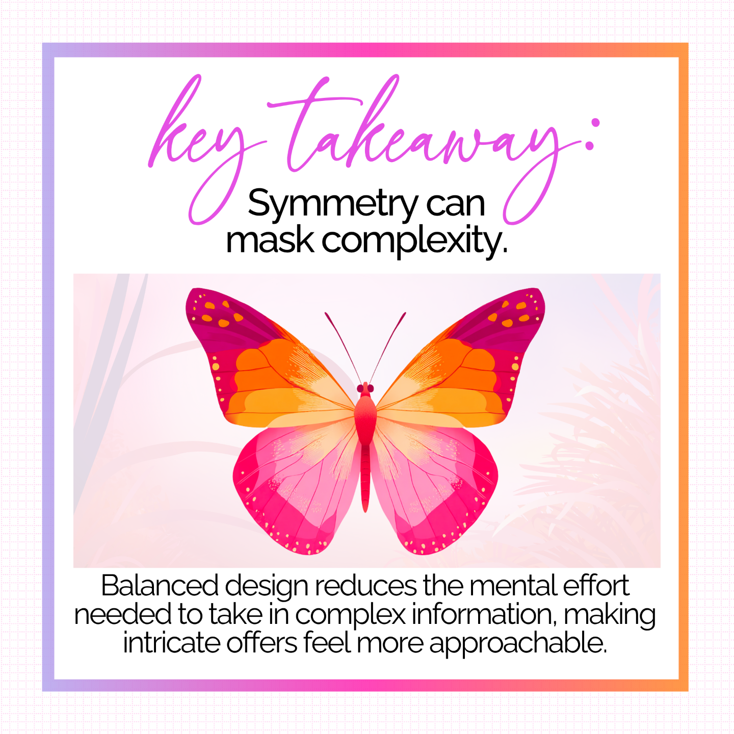
Symmetry has been shown to improve processing fluency: the brain expends less effort when scanning a well-balanced page. The practical benefit for UX is a smoother experience: when a site feels “easy on the eyes,” users navigate and absorb information with less mental friction.
Consistent symmetry (in alignment, spacing, and composition) helps achieve that effortless, user-friendly feel that keeps visitors engaged & more willing to opt-in.
However
There's a catch ...
Visual Ease Needs Real Follow-Through
Symmetry sets an expectation of order and reliability, and buyers notice when it is missing.
A balanced design can make the decision to act feel simple. Symmetry sets the flow in motion, guiding buyers smoothly into your funnel. Every step that follows should reinforce the trust your visuals created, so the journey feels as effortless as it began.
Design For Balance That Drives Action
AI Prompts
Research shows that symmetry creates an immediate sense of stability and harmony, influencing buyers before they consciously process what they see. Balanced layouts, consistent spacing, and mirrored elements do more than make your marketing look polished. They create the confidence to move forward before your audience can even explain why.
To help you design with balance that builds trust and guides buyers smoothly toward yes, here are your AI prompts for this issue:
Prompt #1: Build instant credibility through balance.
Buyers form judgments in seconds, often before reading a single word. Symmetry in layout, spacing, and imagery creates an immediate sense of stability and professionalism. Use that balance to position your offer as credible and worth engaging with right away.
Ask ChatGPT:
"Suggest 5 ways to adjust my existing marketing materials so the design feels more balanced and credible. Include ideas for layout, spacing, alignment, and element placement that work for social posts, landing pages, and email graphics."
Prompt #2: Align every step to reinforce trust.
Symmetry is more than a first impression. When balance is carried through every touchpoint, it reinforces trust and makes the path to action feel easy. Consistent alignment across platforms and formats signals that you deliver with care from start to finish.
Ask ChatGPT:
"Review my landing page copy and layout, then recommend changes to ensure alignment and symmetry are consistent from top to bottom. Include suggestions that maintain flow and make the buying decision feel seamless."


Prompt #3: Create harmony that makes action feel natural.
Balanced design reduces mental load, allowing buyers to focus on your message instead of navigating visual noise. Harmony in visuals can make decisions feel instinctive rather than effortful.
Ask ChatGPT:
"Write 3 variations of a sales page section headline and supporting copy that work best in a perfectly symmetrical layout. Ensure the copy feels calm, clear, and confidence-building to match the balance of the design."
Learn It, Try It
Templates
Use the Symmetry Impulse Collection to design visuals that feel clear, polished, and dependable, making it easier for buyers to trust and act.
The Symmetry Impulse—Template One
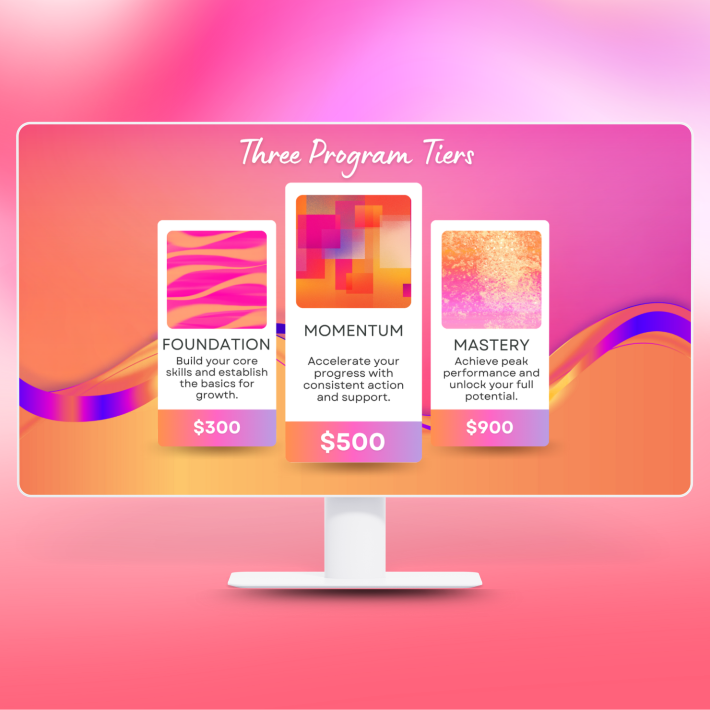
“Parallel Paths” Pricing Tables
These side-by-side slide layouts line up your product or program tiers in perfect visual harmony, making it easy for buyers to compare and choose. The symmetry helps each path feel transparent & trustworthy, clear & compelling.
(size: 1920px 𝓍 1080px)
The Symmetry Impulse—Template Two
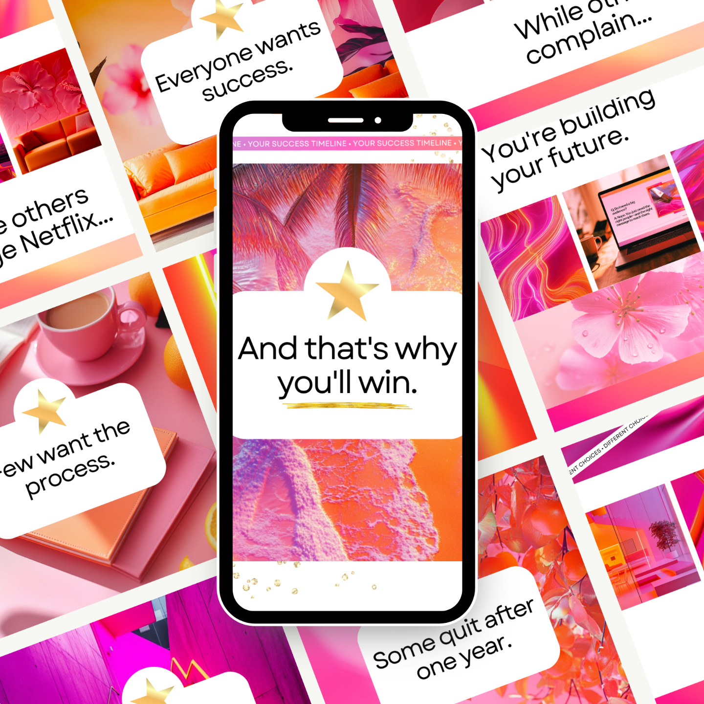
“Mirror Motion” Carousels
This template set uses mirrored layouts and consistent alignment to create a rhythm that feels smooth, cohesive, and easy to follow. Symmetry across the sequence reduces cognitive load, making your message easier to absorb and more memorable as viewers swipe.
(size: 1080px × 1350px)
The Symmetry Impulse—Template Three
“Perfect Proportion” Hero Set
These interchangeable hero section graphics use symmetry to trigger instant perceptions of stability and professionalism — effects shown in research to raise how buyers rate quality and trustworthiness. Centered, mirrored, and/or evenly weighted layouts reduce cognitive load, making it easier for visitors to focus on your message and feel confident navigating down the page. (size: desktop and mobile)
3 Quick Questions To Ask Yourself
Before You Hit Publish:
Create Flow
Does the design lead the viewer naturally from one element to the next without visual hiccups?
Match the Margins
Does the vertical and horizontal spacing and alignment look consistent across the entire layout?
Keep it Centered
Are the key elements positioned in a way that feels balanced from one side to the other, top to bottom?

Behind the Designs
Hi, I'm Sidneyeve.
Graphic & Instructional Designer (ID Harvard DCE), Marketing Professor (PhD UMN), Business Coach (ICF PCC)
Thanks for visiting my studio shop.
I'm a marketing professor who studies online buyer behavior and the emotional impact of visual communication. Through Valentine Design Studio, I translate academic insight into visual strategy for solopreneurs who want to promote their work beautifully and persuasively.
My clients are women selling digital offers on their own. They want marketing that looks polished, communicates value clearly, and reflects the care they bring to their work.
Friendly disclaimer: The information in this newsletter is for educational purposes only. I can’t guarantee specific income or other results. Your outcomes depend on your niche, audience, experience, and how you apply what you learn. Always test, tweak, and trust YOUR data. 🎀
Hope you enjoyed this issue!