



In This Issue
The Affect Heuristic
Trust the Vibe — Your Audience Already Does
Ever felt a “yes” before you knew the details? That’s how your audience decides too. They don’t weigh the facts first. They feel their way there. Your offer doesn't just need to be good. It also needs to feel good, fast.
From Behind University Library Paywalls...
The Research
In 2024, a study in the Journal of Marketing found that visually saturated product designs made buyers perceive the product as stronger, more effective, and more trustworthy -- even when nothing about the actual product changed. The visuals alone created the emotional shortcut.
Meanwhile, researchers studying TikTok flash sales discovered that emotionally charged visuals combined with urgency cues like countdown timers or limited spots made viewers far more likely to buy on impulse. It wasn’t about logic. It was about how the content made them feel in the moment.
[Reference · Journal of Marketing, 2024 · visually saturated product design study]
[Reference · TikTok flash sales study]
Why It Works
emotion = speed
The affect heuristic helps the brain skip over logic-friction. When we feel clarity, safety, or inspiration, we say yes faster, because it feels like the right choice.
Why It Matters
vibe is the verdict
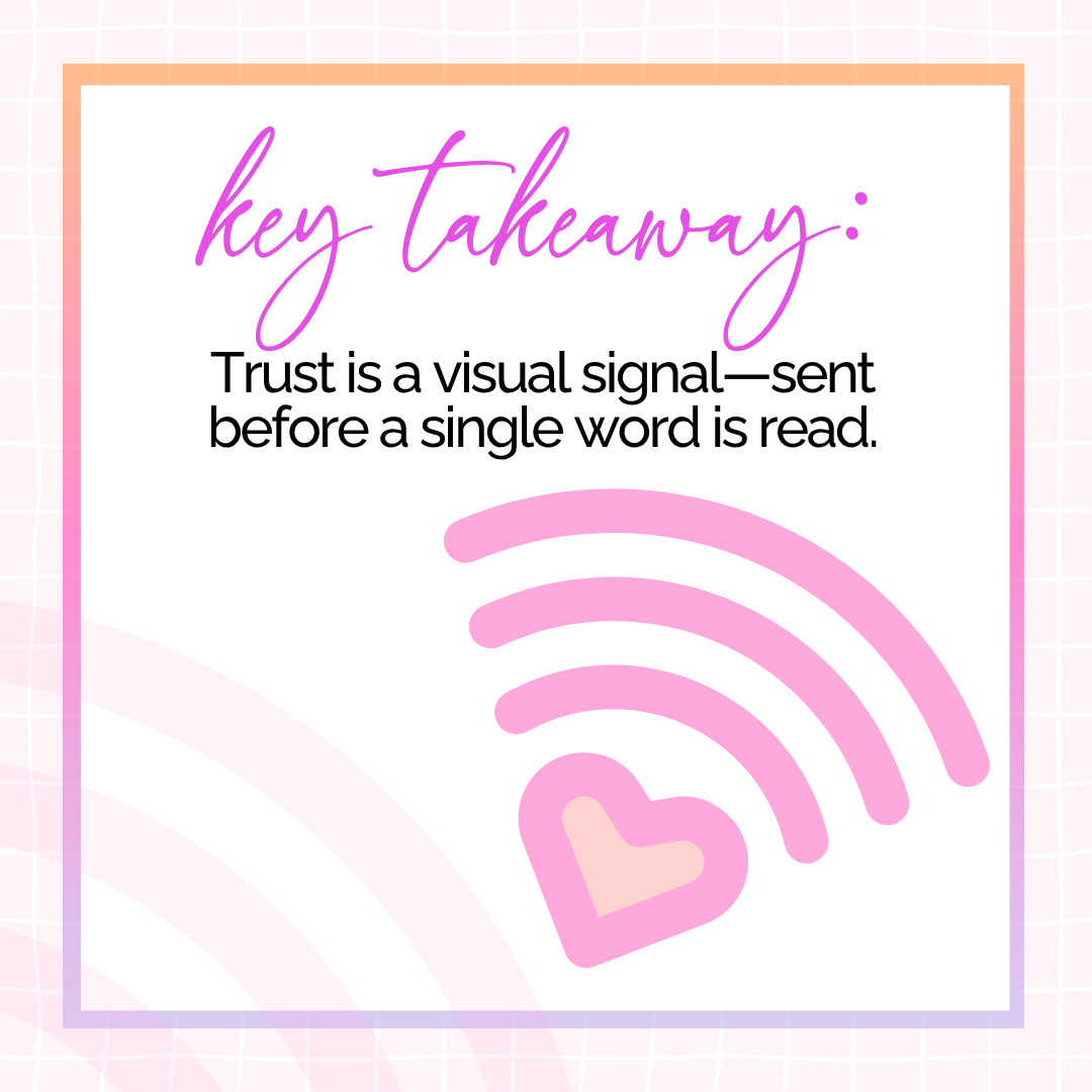
Before your words get a chance to explain, your visuals have already sent a message. It's not just about what we see. It's about what we feel invited to believe.
The Split-Second Decision To Lean In—Or Move On
Here's the secret ...
Think: Emotional Snap Judgments
Before they read, they feel.
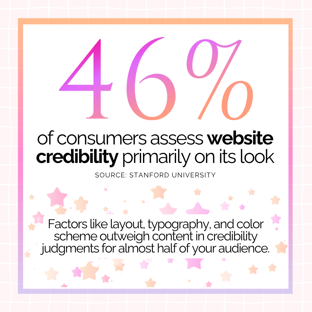
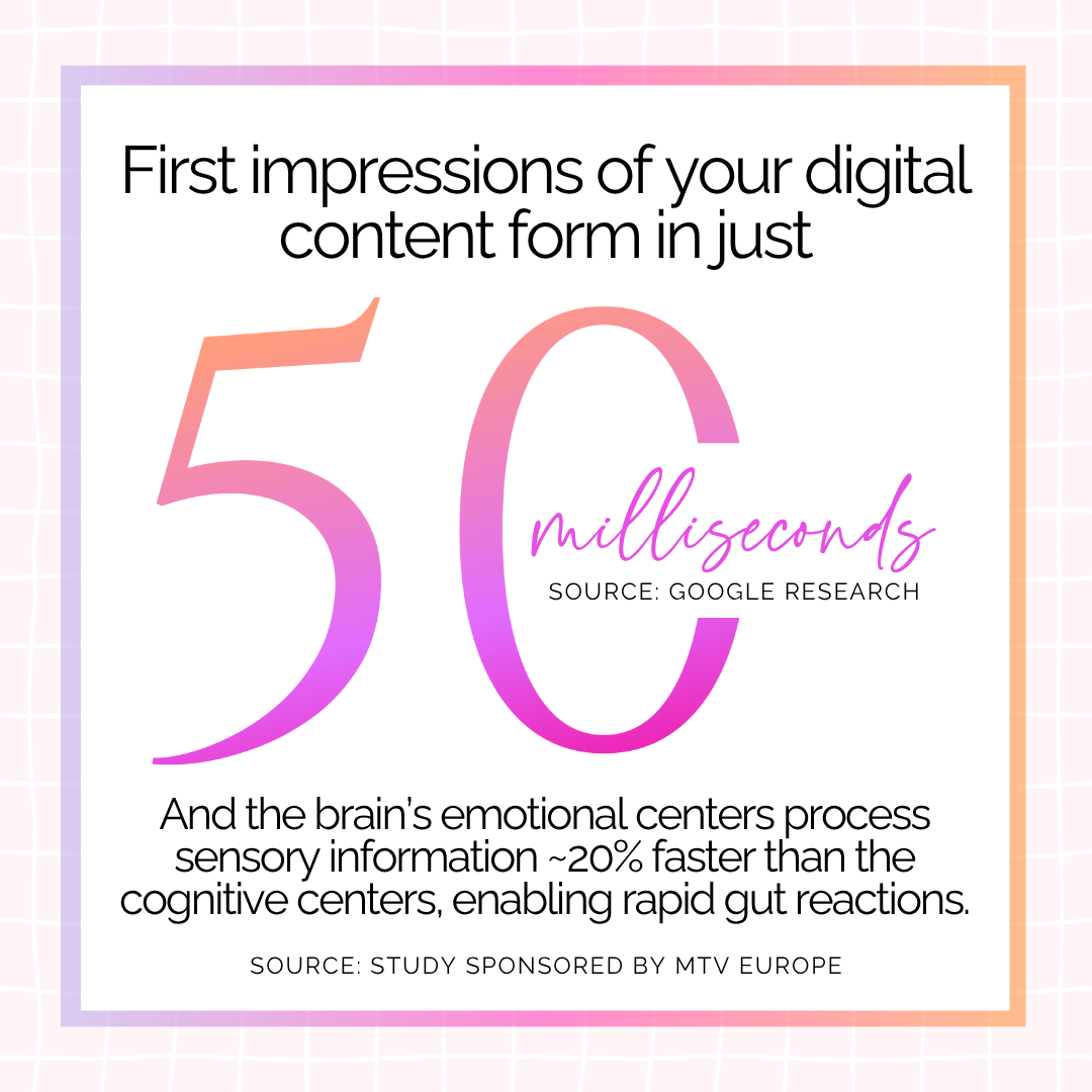
Our brains make fast decisions by scanning for emotional signals. When we see something that looks polished, relevant, or exciting, we unconsciously assign it more value, even before we consciously process what it is.
That means even subtle shifts in design (like bold color, thoughtful whitespace, and high-res visuals) can nudge a viewer toward “this feels right” faster than a bulleted list of benefits ever could.
However
There's a catch ...
You Must Align Feelings with Facts
Emotional design works best when it amplifies the truth, not masks it. If the energy of your visuals says, “this is game-changing,” but your offer under-delivers, trust erodes. That’s the flip side of the affect heuristic: if what we feel and what we get don’t match, we feel duped.
So lead with design. Make it look and feel good. But make sure the experience backs it up.
Design For Decision Shortcuts, Not Deep Analysis
AI Prompts
The affect heuristic teaches us that people don’t weigh options logically. They respond emotionally, then justify it later. That means your design, language, and framing need to do more than look good or sound smart. They need to feel like the right choice before your audience even knows why.
To help you move beyond generic hooks and into truly memorable emotional strategy, here are your AI prompts for this issue:

Prompt #1: Use emotional contrast to spark attention.
We’re more affected by emotional shifts than by static moods. A message that moves from tension to relief or chaos to clarity feels satisfying. Use that arc to hold attention and guide decision-making.
Ask ChatGPT:
"Write a set of 3 headlines or post hooks that begin in an emotional state my audience is trying to escape and end in the feeling they’re secretly chasing. Focus on contrast that feels intuitive and motivating."
Prompt #2: Lean into emotional familiarity.
Our brains are drawn to what feels intuitively true. When a message sounds familiar or deeply resonant, we accept it more quickly. Use emotionally aligned statements that mirror what your audience already suspects or half-believes, then offer a subtle reframe.
Ask ChatGPT:
"Give me 5 emotionally grounded statements about my offer that reflect common thoughts or beliefs my audience already has—then shift them slightly to offer a new, more empowering perspective."

Prompt #3: Create a felt sense of Yes.
The affect heuristic works best when something feels right before it makes sense. That kind of knowing comes from subtle cues, like beauty, clarity, warmth, calm. Use language that evokes emotional safety and positive anticipation. The goal isn’t urgency. It’s resonance.
Ask ChatGPT:
"Help me rewrite this headline or offer intro using metaphors or sensory words that evoke ease, clarity, and alignment, like spaciousness, lightness, energy, or flow. I want it to create a gentle sense of 'this is for me'.”
Learn It, Try It
Templates
Use the Affect Accelerator Collection to spark trust, clarity, and quiet confidence at a glance
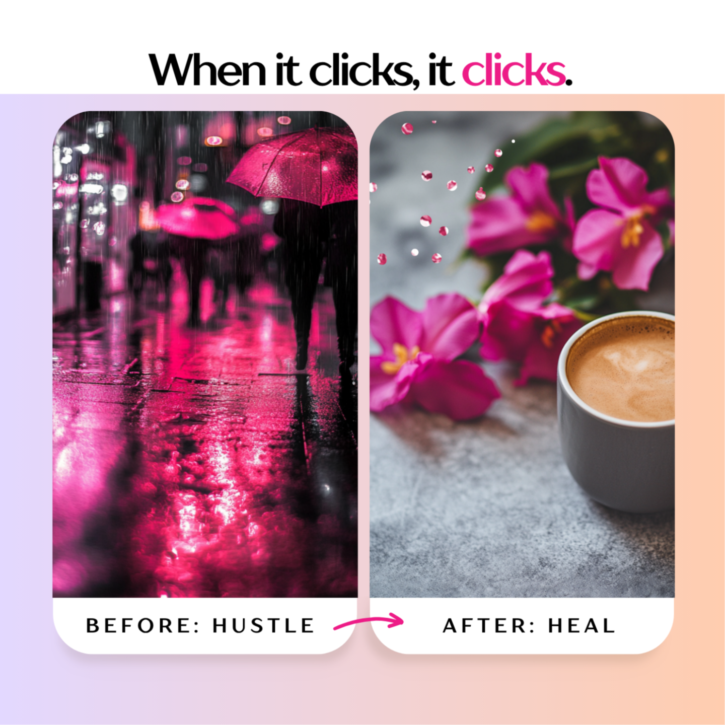
Affect Accelerator—Template One
“This Feels Right” Mini-Maps
These side-by-side visual cue templates let you reframe your offer against common pain points, showing the emotional difference between the before and after. Instead of explaining benefits, you're evoking relief and a sense of momentum.
(size: 1080px 𝓍 1080px)
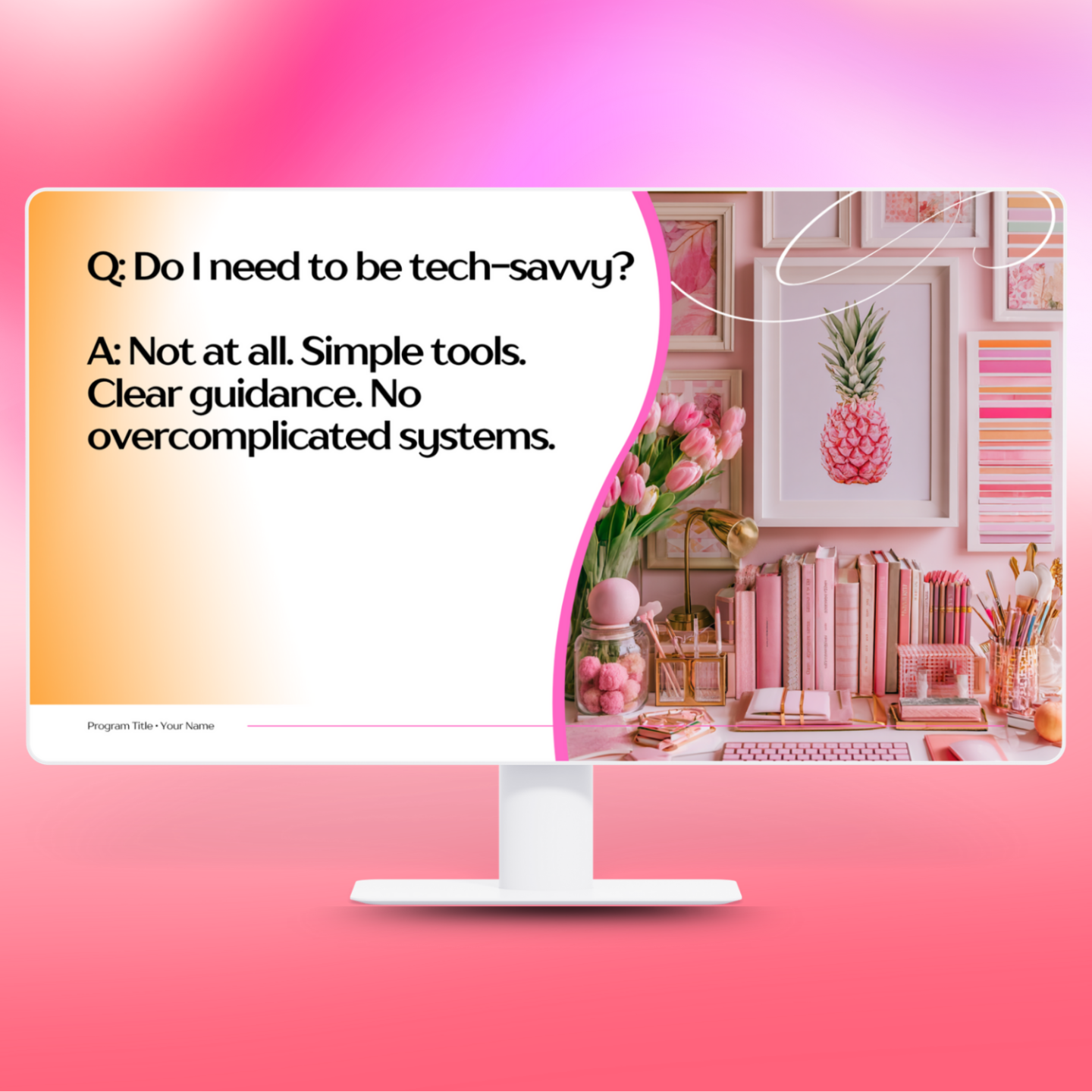
Affect Accelerator—Template Two
“The Safe Yes” FAQ Slides
Reframe standard FAQs with warmth and reassurance. Using soft visual cues and gentle affirmations to help your audience feel more confident saying yes (even if they skim). Designed to lower emotional resistance.
(size: 1640px 𝓍 856px)
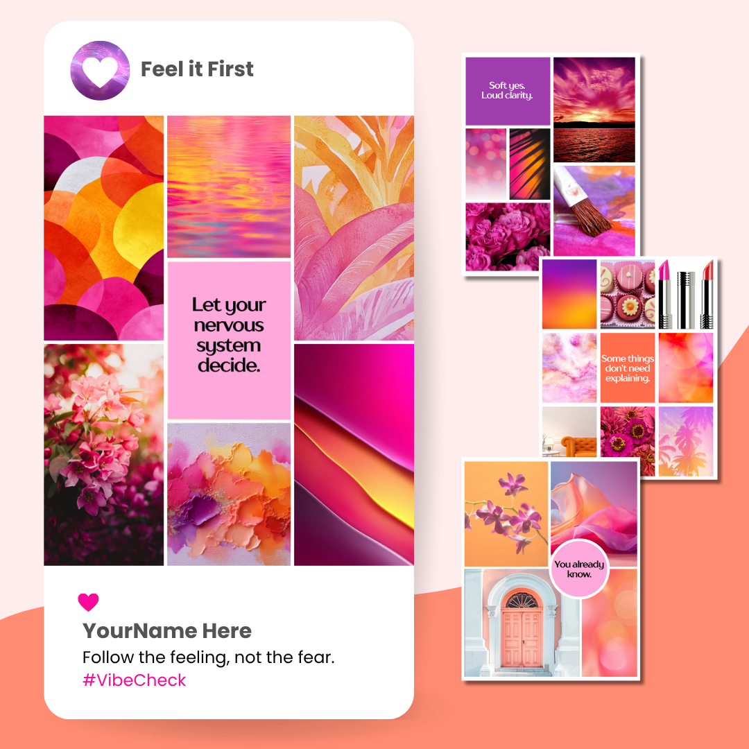
Affect Accelerator—Template Three
“Instant Vibe Check” Covers
Use these to set the emotional tone for a post, webinar, podcast, or new offer. Designed like visual moodboards in a single square, focusing on color, texture, typography, and just a few words to create a felt experience.
(size: 1080px × 1350px)
3 Quick Questions To Ask Yourself
Before You Hit Publish:
Cue an Emotion
When I look at this, can I name the feeling it gives off in the first three seconds?
Feel Familiar
Does this look and sound like something my audience already feels connected to?
Signal Value Fast
If I scroll quickly, is it obvious what this is for and why it might be worth a closer look?

Behind the Designs
Hi, I'm Sidneyeve.
Graphic & Instructional Designer (ID Harvard DCE), Marketing Professor (PhD UMN), Business Coach (ICF PCC)
Thanks for visiting my studio shop.
I'm a marketing professor who studies online buyer behavior and the emotional impact of visual communication. Through Valentine Design Studio, I translate academic insight into visual strategy for solopreneurs who want to promote their work beautifully and persuasively.
My clients are women selling digital offers on their own. They want marketing that looks polished, communicates value clearly, and reflects the care they bring to their work.
Friendly disclaimer: The information in this newsletter is for educational purposes only. I can’t guarantee specific income or other results. Your outcomes depend on your niche, audience, experience, and how you apply what you learn. Always test, tweak, and trust YOUR data. 🎀
Hope you enjoyed this issue!