


Tropic Gold Workshop Kit
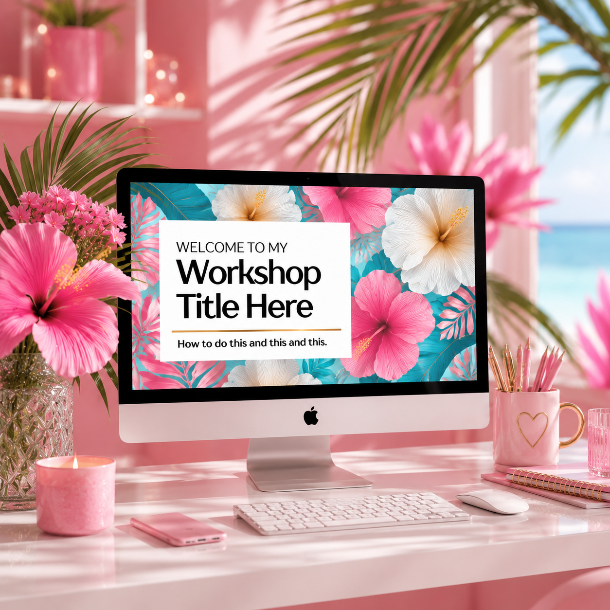
The Tropic Gold Workshop Kit opens with the saturated heat of hibiscus pink and sugar plum, tempered by the clear, luminous aqua of water you can see straight through. Gold runs underneath it all like light hitting the surface at exactly the right angle. Together they create something that feels like peak summer: vivid and alive, but never chaotic.
The Canva Pro kit includes 40 presentation slides, a 10-page professional guide or handout template, and 10 social media graphics — all built in this gold, pink, and aqua tropical palette, ready for your next live event, digital workshop, or signature offering.
Your gift with purchase is 48 coordinating bonus images: hibiscus blooms, sun-warmed water, tropical botanicals in gold and teal, pink-washed horizons — a full visual world that extends across your content and keeps everything gloriously cohesive all summer long.
WORK-IN-PROGRESS
The Color Story
Marketing researchers have long noted that high-saturation palettes register as energetic and emotionally intense — but what makes this combination sophisticated rather than simply bold is the aqua.
Turquoise and teal tones carry an inherent calm that grounds the pinks and golds, giving the whole palette a buoyancy that feels effortless rather than loud. Your audience experiences the energy without being overwhelmed by it. They feel like they've stepped somewhere luminous and meant it.
This is the palette for the workshop host who wants her materials to feel like a destination. Not just professional — evocative. The kind of visual world that makes people want to be inside it, stay longer, and come back again next season.


